
Back to Roots
Design, especially in healthcare has always been quite bland. For a service that aims to take care of people, you’re often greeted with teal word documents void of all soul.
Our aim was to challenge the status’s quo through illustrated resources which explained complex subjects relating to healthcare in a simple, fairy tale-like picture book. Students, Coaches & Clinicians in the health care industry would use this resource to explain topics difficult subjects to their patients.
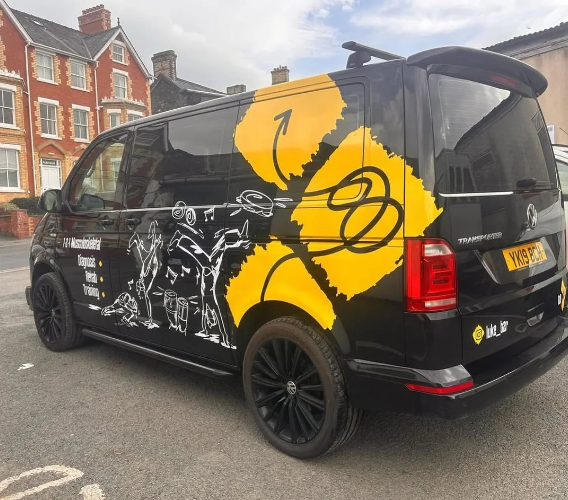
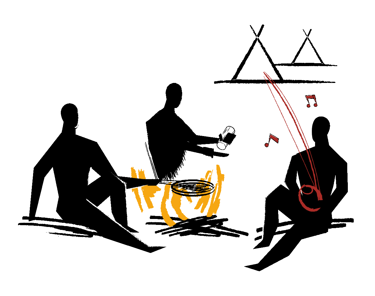
With the brand being “Back to Roots” how far back can you take mankind than to the Stone Age? Inspired by early man cave paintings, taking healthcare back to it’s roots.
Industry
Healthcare, Education
Client
Luke R Davies B2R


PROBLEM
Working alongside Luke Davies over many late sessions over the years, the Back to Roots brand has naturally evolved over the years. The brand has matured, with Luke and the Back to Roots team delivering B2R methodologies over across the work alongside integrating their practises in University courses (such as USW).
While we still wanted to be playful with the B2R brand and resources, we needed to enhance the professionalism. The sketched artwork which worked during B2R’s conception was now dated and hadn’t matured with the B2R.
SOLUTION
Our illustrated overhaul to B2R resources has come from our desire to make healthcare engaging. Why should healthcare be bland?
Over the years, healthcare professionals have found themselves arguing with one other about the best practises and treatments. This has become muddled over the years and Back to Roots have found themselves look back at the past at evidence based research. We asked ourselves… “how far back can we go?” It was in one of our workshops, we decided to go headfirst into the hand cave painted art style, the origins of man and as far back to your roots as you can get.
Running headfirst with this style, we set to work transforming A4 work documents, into engaging story books which anyone could pickup and explain to one another. We wanted people to have a desire to pickup the resources and understand complex topics such as Stress & Novel Movement.
With the evolved brand and style set in stone (literally) we set to work overhauling the Back To Roots website.
We streamlined the full brand toolkit, installing minimal accessible fonts and colours whilst sparing using the original sketched fonts and illustrations. The redesign represents the work Luke and the team have been doing to transform and educate the healthcare industry.